Senior UX Designer focused on scalable product experiences
I work across research, interaction, and interface design, with specialized expertise in design systems.
Explore DBM System
button
button

6+ Years of UX
Designing web, mobile, enterprise experiences, including design systems, in production environments
Design Systems Expertise
Built tokenized foundations with accessible, scalable patterns, plus documentation & governance
Product Design Experience
End-to-end design process, from research through interface design

Most of my work has focused on complex product environments where UX decisions must scale beyond individual features. I design across the full product lifecycle, working closely with business, engineering and product to balance usability, clarity, and long-term maintainability. Whether shaping user flows or establishing shared patterns, I approach design with real production constraints and cross-team alignment in mind.
Design System In Practice
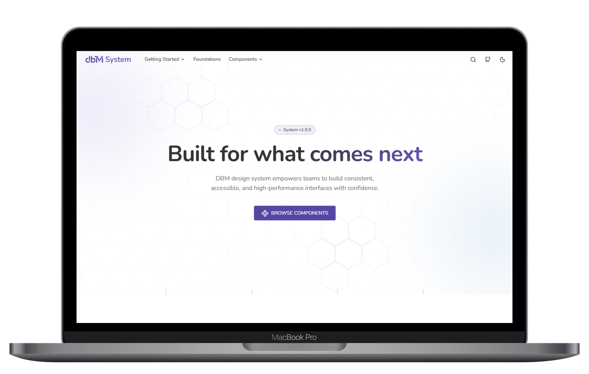
DBM System
A full-scale design system built to support consistent, scalable user interfaces across products and teams. It is designed as a living system, where foundations, components, documentation, and code work together as a single source of truth rather than a static UI kit.
Bridging Design and Implementation
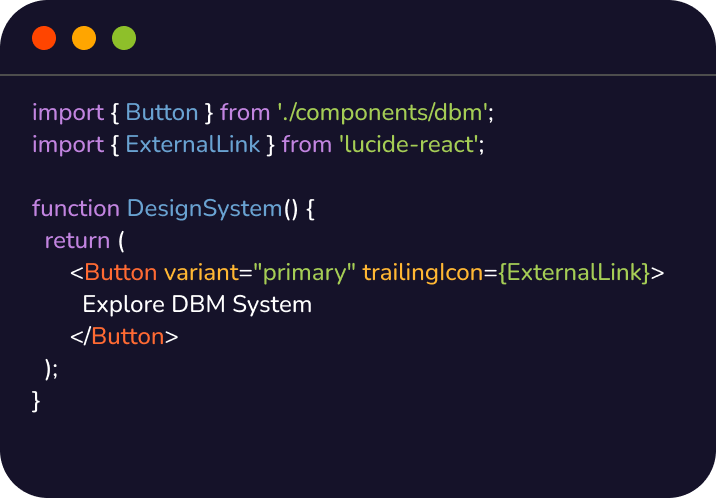
I design systems with implementation in mind. While I’m not a developer by role, I work closely with engineering to ensure design decisions translate clearly into code and remain practical to maintain over time.
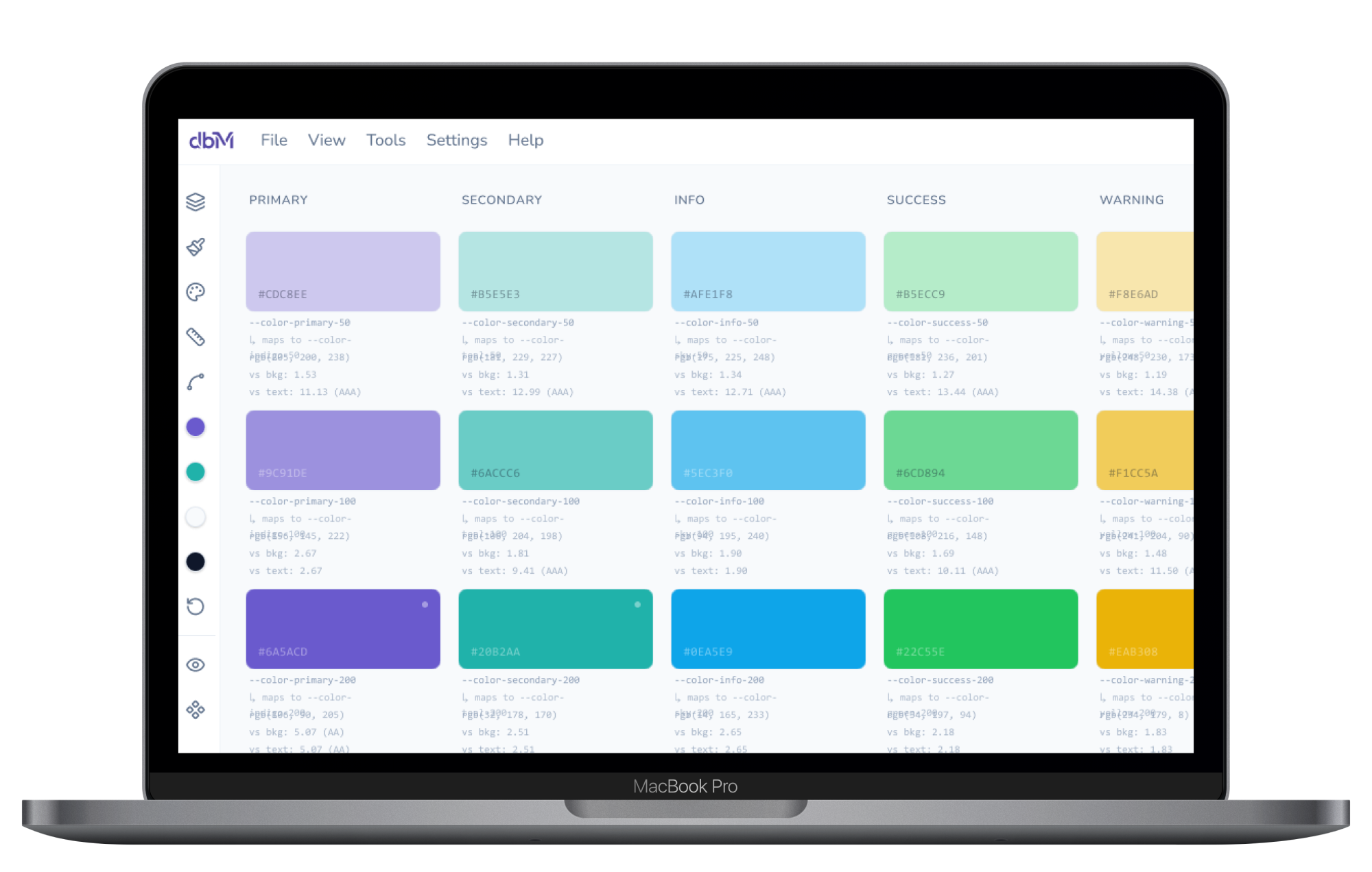
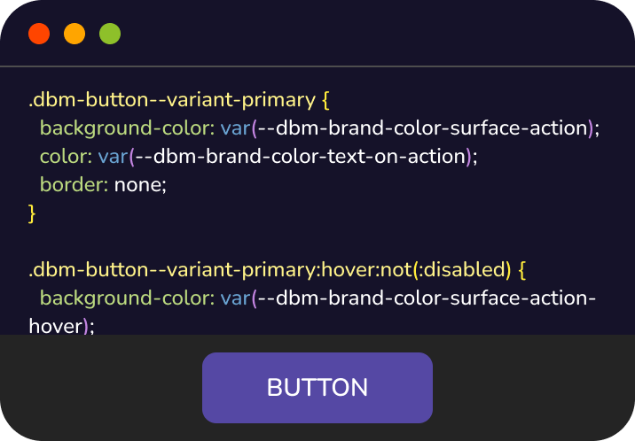
Design tokens mapped directly to production code
Clear parity between design components and implementation
Intentional decisions around component variants and states
Accessibility roles and interaction behavior considered early
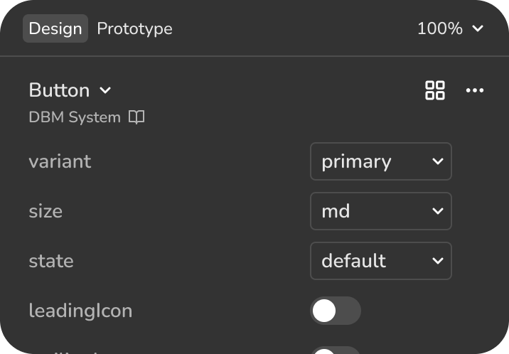


Design for Scale
I approach design systems as products with structure, constraints, and long-term evolution in mind. The architecture is designed to reduce complexity, support consistency, and allow teams to move quickly without breaking the system.
Foundations as constraints
Design tokens and naming conventions create shared language and predictable outcomes.
Components built for composition
Components are designed as flexible building blocks, not one-off solutions.
Governance as enablement
Guidelines and contribution patterns help the system evolve without fragmenting.
Additional Projects
Design Process
Trail Beacon
A mobile application designed to support emergency response in outdoor environments. The experience automates emergency alerts by sharing GPS location and pre-configured messages with designated contacts, while initiating a simultaneous call to emergency services. The focus was on clarity, speed, and reliability under high-stress conditions.
Vibe Coding
Color Schema
A client-side color palette generator built for designers and engineers who care about structure, scalability, and clean handoff. It supports token-based color systems, accessibility considerations, and real-world usage scenarios, making color decisions easier to scale across products.
Built to support:
- Token-based color systems and dynamic primitives
- Light and dark mode workflows
- Accessibility checks, contrast indicators, and grid views
- Real-world previews and presets
- Multiple export formats for clean handoff
Explore Color Schema Tool
_blank

How I Approach Design
I believe good design systems and product experiences reduce complexity rather than add to it. The goal is not rigid consistency, but clarity, flexibility, and trust. Systems should support accessibility by default, respect real-world constraints, and evolve as products and teams change. I focus on building work that scales, lasts, and remains usable well beyond its initial launch.
CURRENT ROLE
Senior UX Designer @ Rooms To Go
Building & maintaining ROOMY design system, and supporting multiple product experiences.
Connect on LinkedIn
button
button
