
Designs by Mason

button
DBM System
Components library & design guidelines
Preview system
button
button
Role:
- Senior UX Designer leading the end-to-end creation of a full-scale design system.
Objective:
- Address pain-points associated with inconsistencies, inefficiencies, and accessibility gaps across multiple product teams.
- Establish a scalable design foundation that supports consistency, speed, and inclusive experiences.
Features:
- Semantic design tokens
- Scalable and customizable components
- Built with accessibility in mind
- Responsive behavior with modes and templates
- Light/Dark modes
- Icons Library
- Comprehensive documentation
Impact:
- Significantly reduced visual inconsistencies across teams
- Accelerated development velocity through implementation-ready components
- Improved accessibility audit outcomes across product areas
- Enabled faster onboarding for new designers and engineers

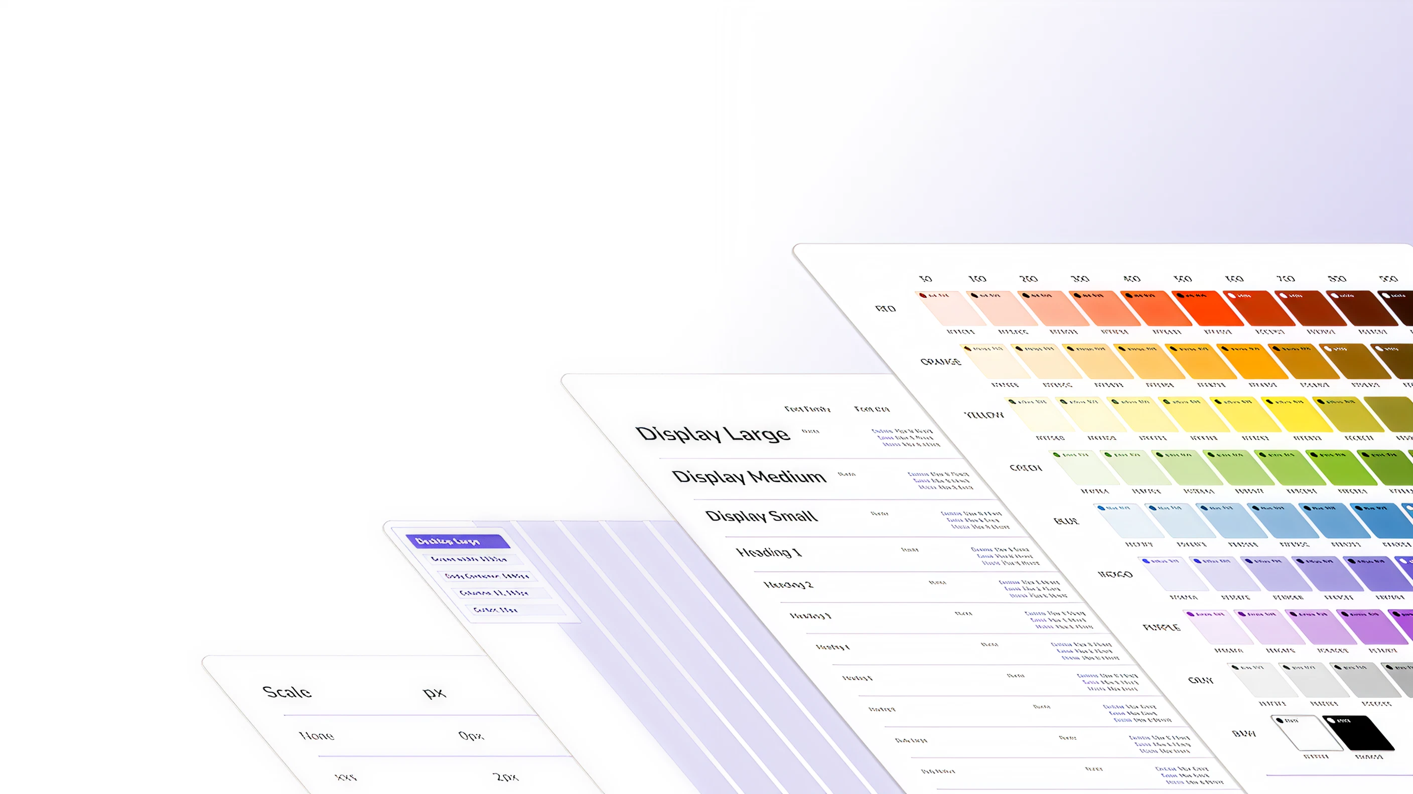
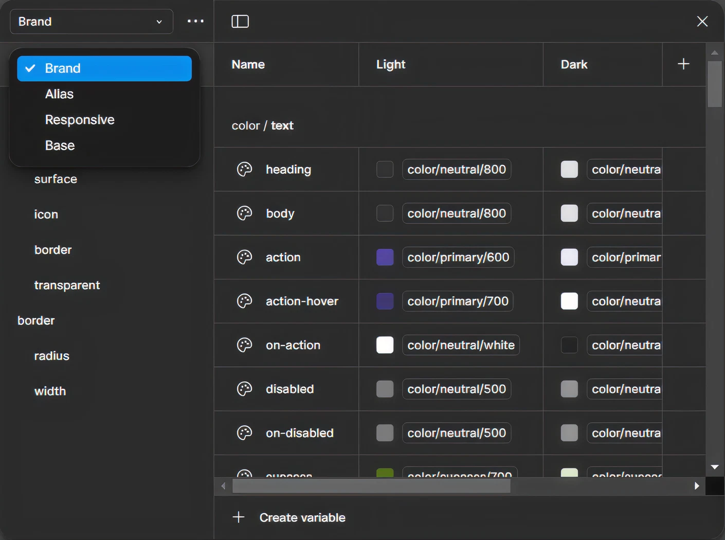
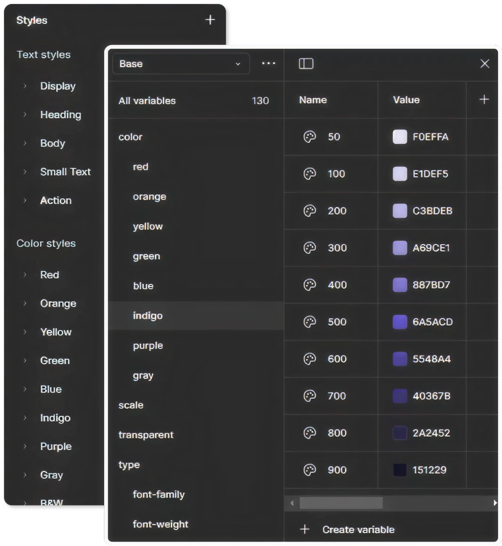
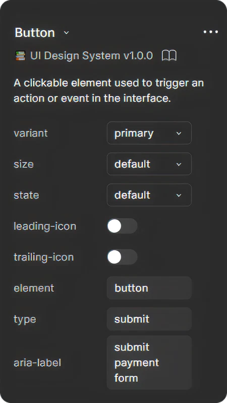
Built on Design Tokens
At the core of the system lies a robust set of semantic design tokens—driving visual consistency and flexibility across platforms. Tokens define color, typography, spacing, radius, elevation, and more. They are structured for easy theming, light/dark mode, and responsive behavior. This foundation ensures design updates are scalable and system-wide.
+520 Tokens
img

Flexible by Design
The system was crafted to be adaptable—supporting multiple brands, product verticals, and future iterations. Components are built with flexibility in mind, allowing teams to override styles, swap tokens, or adjust layouts without breaking consistency or structure.
+150 Styles
Scalable from the Ground Up
The system is built using an atomic-inspired structure—from foundational elements like colors, icons, and typography (atoms), to functional groups like input fields (molecules), and full-featured patterns like navigation bars and cards (organisms). This modular approach makes it easy to scale and maintain across products and teams.
+35 Core Components
+1400 Variants
img

Title
Subtitle
Body
Button
button
button
img
Title
Subtitle
Body
Button
button
button
img
Title
Subtitle
Body
Button
button
button
img
Title
Subtitle
Body
Button
button
button

button

button
region
scrollbar
0
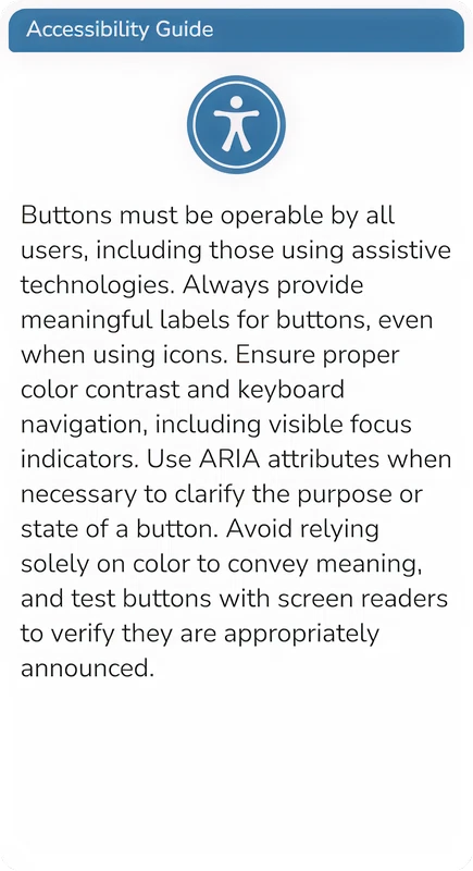
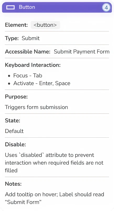
Accessible by Default
Accessibility is thoughtfully integrated throughout the system. Care has been taken to ensure accessible color contrast, keyboard-friendly interactions, and inclusion of key ARIA attributes where relevant. For components that require further implementation details, guidance and documentation are provided—empowering teams to design and build with greater inclusion in mind. The system includes a built-in accessibility annotation kit.
button
button
Designed for Any Mode
The system supports both light & dark themes using a token-based theming layer. Semantic tokens map core visual styles to each theme—allowing seamless switching and consistent experiences across modes with minimal rework.

Light mode is active
alert
assertive
progressbar
0
100
true
67
%


Tokenized
System
button
Aa
Nunito
radio
radio
radio
radio
radio
radio
radio
radio

radio
radio
radiogroup
2
3
4
5

Accessible
Preview
button
button
Description
From Dawn to Dusk—your interface will stay perfectly in tune!
Additional Features
Responsive Layouts
Components and grids adapt fluidly across breakpoints—mobile, tablet, and desktop.
Developer Ready
Structured for implementation with consistent logic, states, and naming.
Documentation
Usage guidelines, best practices, and developer specs built directly into the system.
File Organization
Layered, modular file structure for scalability, clarity, and versioning.
Preview
Preview The System
Browse the design system, and explore how the file is structured using the preview screen below. Whether you’re a designer or developer, this system is made to meet you where you work. Click on the dropdown menu in the upper-left of the preview screen to explore different pages in the design system.
Designs by Mason
Say hi 👋 on

button
DBM System
Components library & design guidelines
Role:
- Senior UX Designer leading the end-to-end creation of a full-scale design system.
Objective:
- Address pain-points associated with inconsistencies, inefficiencies, and accessibility gaps across multiple product teams.
- Establish a scalable design foundation that supports consistency, speed, and inclusive experiences.
Features:
- Semantic design tokens
- Scalable and customizable components
- Built with accessibility in mind
- Responsive behavior with modes and templates
- Light/Dark modes
- Icons Library
- Comprehensive documentation
Impact:
- Significantly reduced visual inconsistencies across teams
- Accelerated development velocity through implementation-ready components
- Improved accessibility audit outcomes across product areas
- Enabled faster onboarding for new designers and engineers
Built on Design Tokens
At the core of the system lies a robust set of semantic design tokens—driving visual consistency and flexibility across platforms. Tokens define color, typography, spacing, radius, elevation, and more. They are structured for easy theming, light/dark mode, and responsive behavior. This foundation ensures design updates are scalable and system-wide.
+520 Tokens
img

Flexible by Design
The system was crafted to be adaptable—supporting multiple brands, product verticals, and future iterations. Components are built with flexibility in mind, allowing teams to override styles, swap tokens, or adjust layouts without breaking consistency or structure.
+150 Styles
Scalable from the Ground Up
The system is built using an atomic-inspired structure—from foundational elements like colors, icons, and typography (atoms), to functional groups like input fields (molecules), and full-featured patterns like navigation bars and cards (organisms). This modular approach makes it easy to scale and maintain across products and teams.
+35 Core Components
+1400 Variants
img
Title
Subtitle
Body
Button
button
button
img
Title
Subtitle
Body
Button
button
button
img
Title
Subtitle
Body
Button
button
button
img
Title
Subtitle
Body
Button
button
button
button
button
region
scrollbar
0
Accessible by Default
Accessibility is thoughtfully integrated throughout the system. Care has been taken to ensure accessible color contrast, keyboard-friendly interactions, and inclusion of key ARIA attributes where relevant. For components that require further implementation details, guidance and documentation are provided—empowering teams to design and build with greater inclusion in mind. The system includes a built-in accessibility annotation kit.
button
button
Designed for Any Mode
The system supports both light & dark themes using a token-based theming layer. Semantic tokens map core visual styles to each theme—allowing seamless switching and consistent experiences across modes with minimal rework.
Light mode is active
alert
assertive
progressbar
0
100
true
67
%
Tokenized
System
button
M
Aa
Nunito
radio
radio
radio
radio
radio
radio
radio
radio
radio
radio
radiogroup
2
3
4
5
Accessible
Preview
button
button
Description
From Dawn to Dusk—your interface will stay perfectly in tune!
Additional Features
Responsive Layouts
Components and grids adapt fluidly across breakpoints—mobile, tablet, and desktop.
Developer Ready
Structured for implementation with consistent logic, states, and naming.
Documentation
Usage guidelines, best practices, and developer specs built directly into the system.
File Organization
Layered, modular file structure for scalability, clarity, and versioning.
Preview
Preview The System
Browse the design system, and explore how the file is structured using the preview screen below. Whether you’re a designer or developer, this system is made to meet you where you work. Click on the dropdown menu in the upper-left of the preview screen to explore different pages in the design system.
Designs by Mason
Say hi 👋 on
DBM System
Components library & design guidelines
Role:
- Senior UX Designer leading the end-to-end creation of a full-scale design system.
Objective:
- Address pain-points associated with inconsistencies, inefficiencies, and accessibility gaps across multiple product teams.
- Establish a scalable design foundation that supports consistency, speed, and inclusive experiences.
Features:
- Semantic design tokens
- Scalable and customizable components
- Built with accessibility in mind
- Responsive behavior with modes and templates
- Light/Dark modes
- Icons Library
- Comprehensive documentation
Impact:
- Significantly reduced visual inconsistencies across teams
- Accelerated development velocity through implementation-ready components
- Improved accessibility audit outcomes across product areas
- Enabled faster onboarding for new designers and engineers
Built on Design Tokens
At the core of the system lies a robust set of semantic design tokens—driving visual consistency and flexibility across platforms. Tokens define color, typography, spacing, radius, elevation, and more. They are structured for easy theming, light/dark mode, and responsive behavior. This foundation ensures design updates are scalable and system-wide.
+520 Tokens
img

Flexible by Design
The system was crafted to be adaptable—supporting multiple brands, product verticals, and future iterations. Components are built with flexibility in mind, allowing teams to override styles, swap tokens, or adjust layouts without breaking consistency or structure.
+150 Styles
Scalable from the Ground Up
The system is built using an atomic-inspired structure—from foundational elements like colors, icons, and typography (atoms), to functional groups like input fields (molecules), and full-featured patterns like navigation bars and cards (organisms). This modular approach makes it easy to scale and maintain across products and teams.
+35 Core Components
+1400 Variants
img
Title
Subtitle
Body
Button
button
button
img
Title
Subtitle
Body
Button
button
button
img
Title
Subtitle
Body
Button
button
button
img
Title
Subtitle
Body
Button
button
button
button
button
region
scrollbar
0
button
button
Accessible by Default
Accessibility is thoughtfully integrated throughout the system. Care has been taken to ensure accessible color contrast, keyboard-friendly interactions, and inclusion of key ARIA attributes where relevant. For components that require further implementation details, guidance and documentation are provided—empowering teams to design and build with greater inclusion in mind. The system includes a built-in accessibility annotation kit.
Designed for Any Mode
The system supports both light & dark themes using a token-based theming layer. Semantic tokens map core visual styles to each theme—allowing seamless switching and consistent experiences across modes with minimal rework.
Light mode is active
alert
assertive
progressbar
0
100
true
67
%
Tokenized
System
button
M
Aa
Nunito
radio
radio
radio
radio
radio
radio
radio
radio
radio
radio
radiogroup
2
3
4
5
Accessible
Preview
button
button
Description
From Dawn to Dusk—your interface will stay perfectly in tune!
Additional Features
Responsive Layouts
Components and grids adapt fluidly across breakpoints—mobile, tablet, and desktop.
Developer Ready
Structured for implementation with consistent logic, states, and naming.
Documentation
Usage guidelines, best practices, and developer specs built directly into the system.
File Organization
Layered, modular file structure for scalability, clarity, and versioning.
Preview
Preview The System
Browse the design system, and explore how the file is structured using the preview screen below. Whether you’re a designer or developer, this system is made to meet you where you work. View the preview in full screen mode by clicking on the double arrow button in the upper-right (recommended). Click on the dropdown menu in the upper-left of the preview screen to explore different pages in the design system.