

A scalable design system unifying design, code, and documentation into a single source of truth.
Explore DBM System

button
button
Role:
Product Designer (End-to-End)
Responsibilities:
System strategy, component design, documentation, design tokens, developer alignment
Problem:
Design systems are often fragmented, poorly documented, or treated as static UI kits, making them difficult to scale and adopt.
Solution:
Created DBM System, a full-scale design system that includes documentation, design and code components library working together as a single source of truth.
Expected Impact:
Improved consistency, faster design-to-development workflows, and clearer cross-team alignment through a centralized system.
My Contributions:
Defined system architecture, designed components, created documentation, and established a scalable structure for long-term growth.
Problem & Context
Design systems are often introduced as UI libraries but fail to scale because they lack structure, governance, and clear documentation. This leads to:
- Inconsistent UI patterns across products
- Repeated design and engineering effort
- Slow onboarding for designers and developers
- Misalignment between design intent and implementation
This project was created to solve two problems:
- Demonstrate a complete, real-world approach to design systems
- Explore how a system can function as a single source of truth across design and code
Constraints:
- No organizational constraints (self-initiated)
- No existing system to build on
- Needed to simulate real-world scalability and usage
Stakeholders (Simulated):
Designers (usability and consistency), Developers (implementation clarity), Product teams (efficiency and reuse)
Users & Insights
Research methods included heuristic evaluation of existing design systems, competitive analysis of established systems such as Material, Polaris, and Atlassian, and a review of industry best practices and documentation standards.
Key Insights:
- Documentation is often the weakest link - Many systems provide components but lack clear usage guidance, making adoption inconsistent.
- Design and code are frequently misaligned - Without a shared structure (tokens, naming, logic), implementation drifts from design intent.
- Systems fail without scalability in mind - Flat or ad-hoc structures break down as systems grow.
- Adoption depends on clarity, not just quality - Even well-designed components fail if they are hard to understand or use.
Assumptions (Explicit):
- Teams will adopt systems that reduce cognitive load
- Clear documentation improves consistency and speed
- A unified structure improves cross-functional alignment
Strategy & Approach
I approached DBM as infrastructure, not a UI kit.
Core Principles:
- Single Source of Truth - Design, code, and documentation must stay aligned
- Scalability First - Structure must support growth without breaking
- Clarity Over Completeness - Well-documented components are more valuable than a large but unclear library
- System, Not Screens- Focus on patterns and rules rather than individual UI instances
System Architecture:
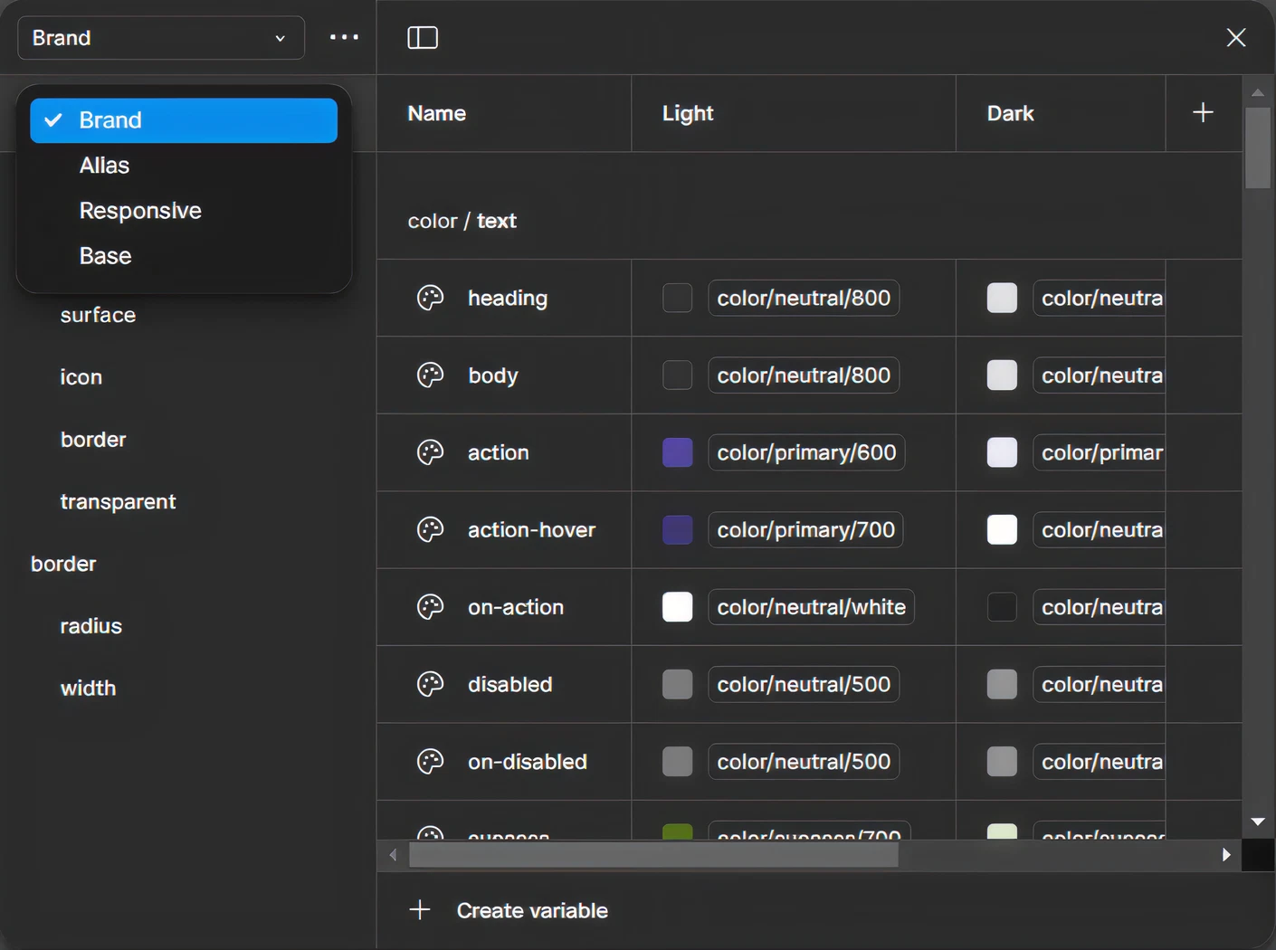
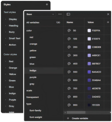
- Foundations (color, typography, spacing, tokens)
- Components (reusable UI elements)
- Documentation (usage, guidelines, rationale)
- Code layer (mirroring design structure)
Tradeoffs:
- Chose to go deeper on fewer components to demonstrate quality and scalability
- Balanced strict system rules with enough flexibility for real-world use
- Avoided over-engineering tokens to keep the system approachable
Alignment Approach:
- Even as a solo project, decisions were framed as if aligning with: Designers (usability) and Developers (implementation logic)


Exploration & Iteration
Balanced System
- Integrated components, tokens, and documentation
- Optimized for both usability and scalability
Iteration Process
- Refined component structure based on heuristic evaluation
- Improved naming conventions for clarity and consistency
- Simplified documentation to reduce cognitive load
Feedback Sources
- Self-critique using UX heuristics
- Benchmarking against industry systems
- Iterative refinement based on clarity and usability

Final Solution
DBM is a living design system composed of:
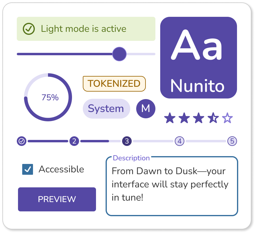
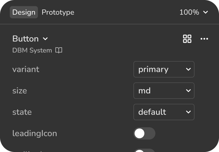
1. Design Component Library - Tokenized, reusable, scalable UI components; designed with clear states and variations in Figma
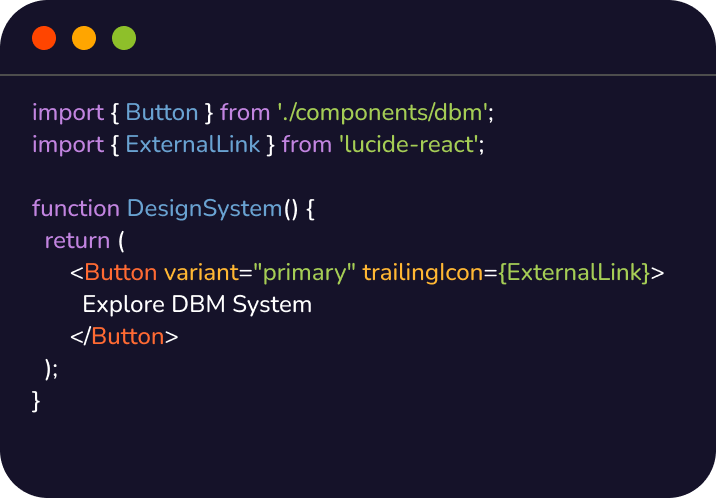
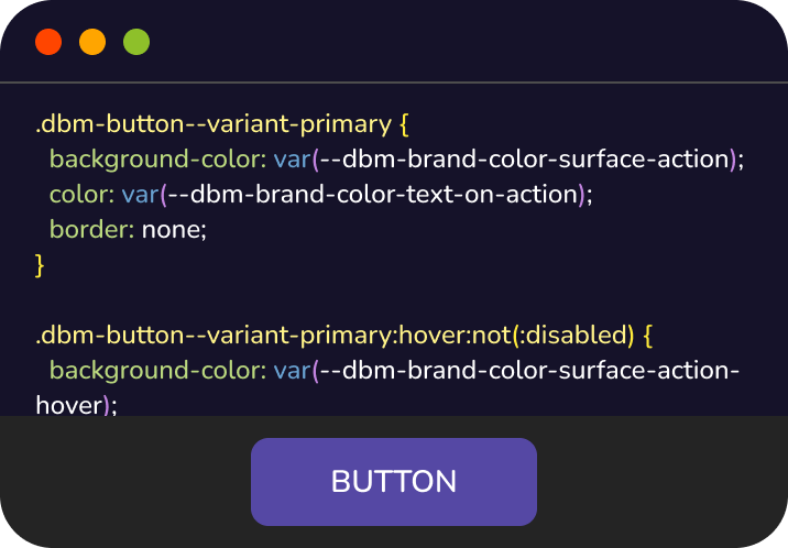
2. Code Component Library - React components structured to mirror design logic; reduces friction between design and development
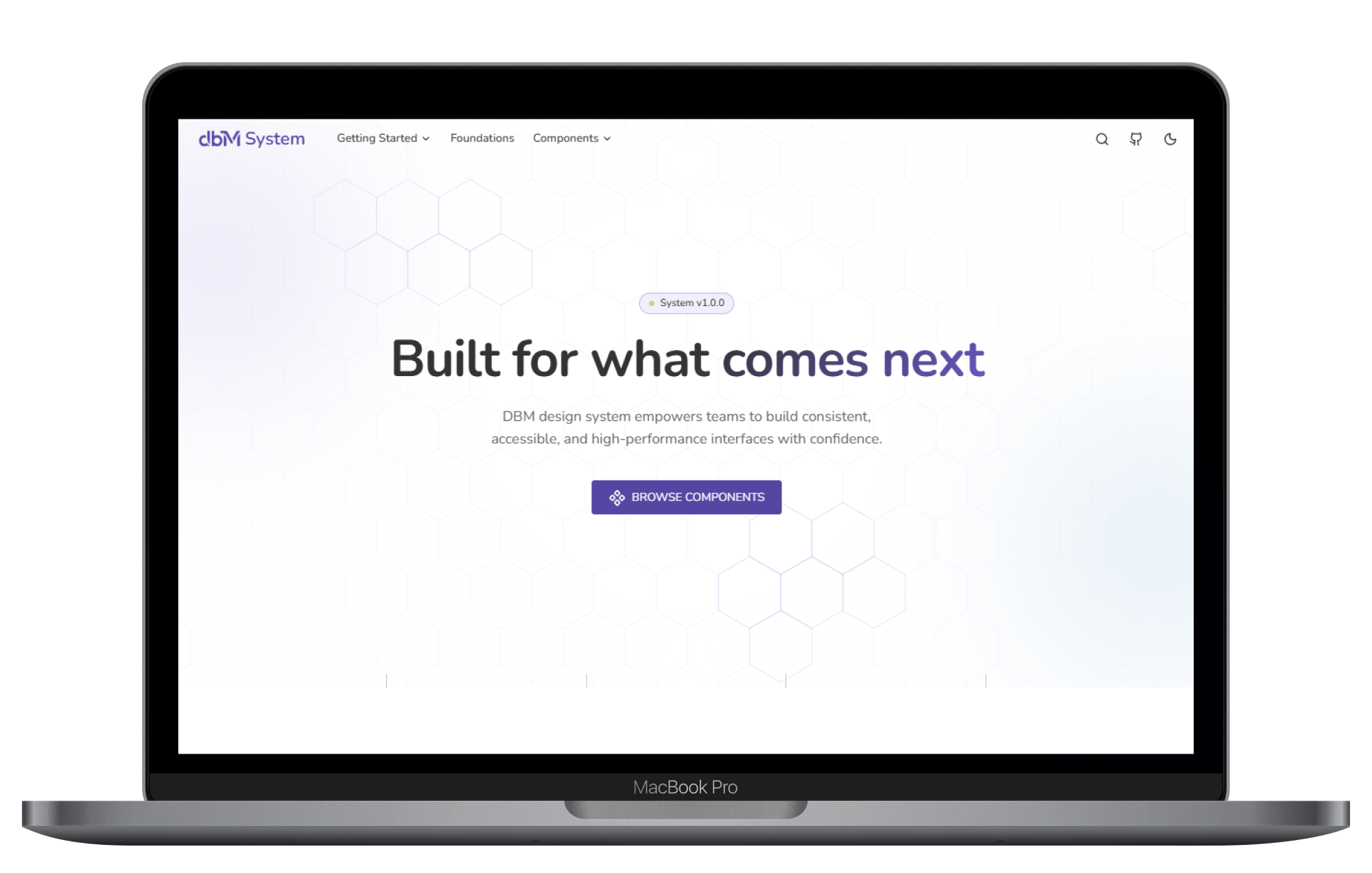
3. Documentation Website - Usage guidelines, rationale, and examples; Structured for quick scanning and deep understanding
Key Design Decisions:
- Components include usage guidance, not just visuals
- Naming conventions prioritize clarity over cleverness
- Documentation is treated as a core product, not an afterthought
Expected Impact
Expected Improvements
- Consistency - Unified tokens and components reduce UI inconsistencies
- Efficiency - Reusable components reduce redundant design and development work
- Clarity - Documentation improves onboarding and decision-making
- Scalability - Structured system supports long-term growth
Why This Works:
- Recognition over recall (clear documentation)
- Consistency and standards (shared components)
- Reduced cognitive load (structured system)
Validation Approach
What To Test
- Ease of component usage
- Documentation clarity
- Design-to-development handoff efficiency
Methods
- Usability Testing - Designers and developers complete tasks using the system
- A/B Testing - Compare workflows with and without the system
- Analytics - Measure component reuse and documentation engagement
Success Metrics
- Task success rate
- Time to implement components
- Reduction in design inconsistencies
- Adoption rate across teams
Role & Reflection
This was a self-initiated project that I executed end-to-end. I defined the system strategy and architecture, designed the foundations and components, built the documentation structure and content, and ensured alignment between design and code. While working independently, I approached the project as if collaborating with cross-functional teams, simulating real-world considerations and designing with both designer and developer needs in mind.
What Worked Well:
- Treating documentation as a core product significantly improved clarity
- Focusing on system structure elevated the work beyond UI design
What I would Do Differently:
- Introduce real user validation earlier
- Test documentation usability with external designers/developers
Risk & Assumptions:
- Assumes teams will adopt structured systems
- Assumes documentation clarity directly improves efficiency
The key learning is that the most valuable part of a design system is not the components themselves, but how clearly they communicate how to use them. As far as next steps, I would like to expand component library to cover more complex patterns.


